
A theme sets the look of your published form: its colours, fonts, background, and picture.
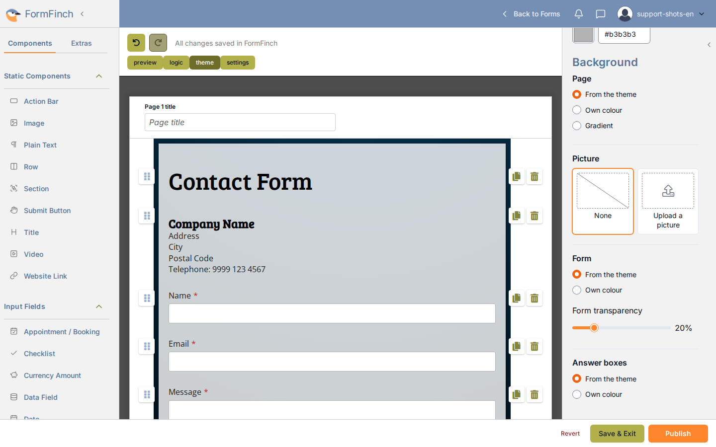
The Theme panel sits beside the canvas, with change theme at the top.
Open the Theme panel
All styling controls are gathered in the Theme panel, so you can see changes directly on the form.
- Open the form in the designer.
- Click theme in the top toolbar. The panel opens on the right.
After you click Cancel or Change theme in the catalogue, the designer opens on this panel again.
Choose a catalogue theme
The catalogue is a separate page where you can preview each theme on your own form before choosing.
- In the Theme panel, click change theme.
- Browse through the categories to find a theme that fits your form. Click Preview on any card to see your form with that theme’s default styling, or click Select.
- In the bottom bar, click Change theme to apply it.
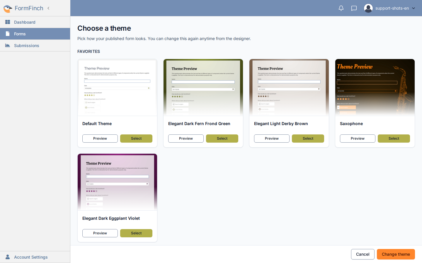
Cancel returns to the designer without changing the theme.
Which themes you can customise
Every theme in the catalogue can be customised, including Classic and Default Theme, on all plans. The options in the Theme panel depend on the theme. See Customise a theme.
When respondents see it
The designer shows the new theme straight away. Respondents see it only after you click Publish in the top toolbar. See Publishing a form for the full publishing flow.