The Form Designer
The Form Designer is the page where you design your form. It offers a wide range of options and in this article, we will walk you through all the things you can do on this page.
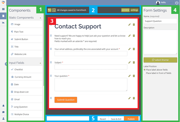
When you open a form in the designer you might notice it has five distinct parts:
- Components: lists all available components you can use on the form.
- Status Bar: displays the save states including the undo and redo actions as well as the buttons to display the form settings and switch to preview mode.
- Canvas area: where you place the components you want to use.
- Form Settings and Properties: displays the form settings or the properties of the current selected field.
- A button bar with available actions.
Components
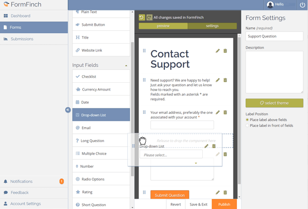
The components area shows lists of all the components that you can place on your form. The components divide into lists according to the component purpose.
The first list holds static components, which means these are components that you cannot use to answer questions but instead you use them to clarify the form purpose or to submit all answers on the form.
Input fields have the purpose to answer the questions on the form. You should choose the component that best suits the type of question you are asking. One input field results in an answer on the form and all answers gathered in the submission data are send with the submit button.
You can drag a component to the canvas area or click a component to add it to your form.
Status bar
The status bar includes the following elements:
Undo
If you press this button you undo your last design change.
You can undo changes up to the point where you opened the designer. If you want to restore even further back, you can achieve this on the Form Details page in the History section.
Redo
If you press this button you redo the last design change that was previously undone.
The autosave status
FormFinch autosaves all changes you make to your design. The status tells you whether this mechanism has saved all your changes.
Preview
Clicking this button will enable you to view and test your form without the need to publish it first.
Form settings
Show the form settings. This button is only clickable when the form settings panel is not visible because you selected a component on your canvas. Clicking this button changes the panel back to Form Settings.
Canvas area
The form canvas is the work area of your form and the place where you place components to build the form content. It has capabilities of selecting, editing, deleting, and rearranging components. When you make changes to the properties of components you will see those changes reflected in the components displayed on the canvas.
Form settings & Properties
On the Form Settings panel you can edit the name of your form, add a description, change the label position and theme of the form.
When a component on your canvas is selected this panel will change to display the component properties so you can review and edit those. For a complete rundown of all the property settings of a component you can read the articles about the components you want to learn more about.
The button bar
The buttons on the bottom of the designer allow you to do the following actions:
Revert
Revert the form to the initial design when the designer was opened.
Save & Exit
Send all pending changes at once to the server and take you back to the Forms page.
Publish
Publish the form and make it available live to your audience. You are informed of the location where the live form is found and how to embed the form on your own website. This replaces the published live version of this form with your current design changes.